
Causal Quartets: Different Ways to Obtain the Same Average Treatment Effect
Andrew Gelman, Jessica Hullman, Lauren Kennedy
American Statistician
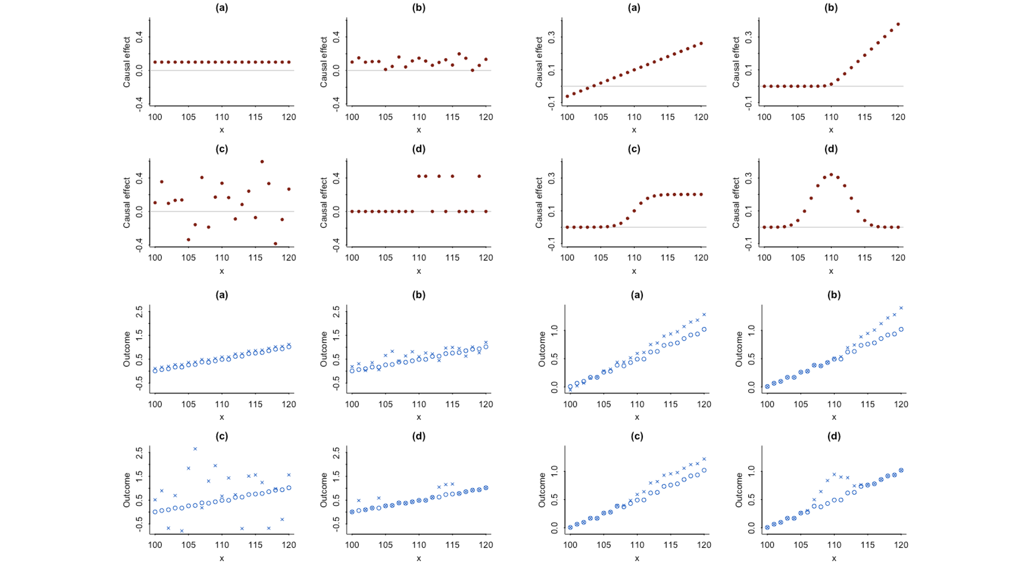
Causal quartets showing possible patterns of random variation (left) and systematic variation (right) for an estimated average treatment effect of 0.1. The upper plots summarize possible individual-level treatment effects. The lower plots depict what these effects might look like in observables space under each treatment.
Abstract
The average causal effect can often be best understood in the context of its variation. We demonstrate with two sets of four graphs, all of which represent the same average effect but with much different patterns of heterogeneity. As with the famous correlation quartet of Anscombe (1973), these graphs dramatize the way in which real-world variation can be more complex than simple numerical summaries. The graphs also give insight into why the average effect is often much smaller than anticipated.