
Swaying the Public? Impacts of Election Forecast Visualizations on Emotion, Trust, and Intention in the 2022 U.S. Midterms
Fumeng Yang, Mandi Cai, Chloe Mortenson, Hoda Fakhari, Ayse D. Lokmanoglu, Jessica Hullman, Steven Franconeri, Nicholas Diakopoulos, Erik C. Nisbet, Matthew Kay
IEEE Trans. Visualization & Comp. Graphics (Proc. VIS) 2023 | ![]() BEST PAPER AWARD
BEST PAPER AWARD
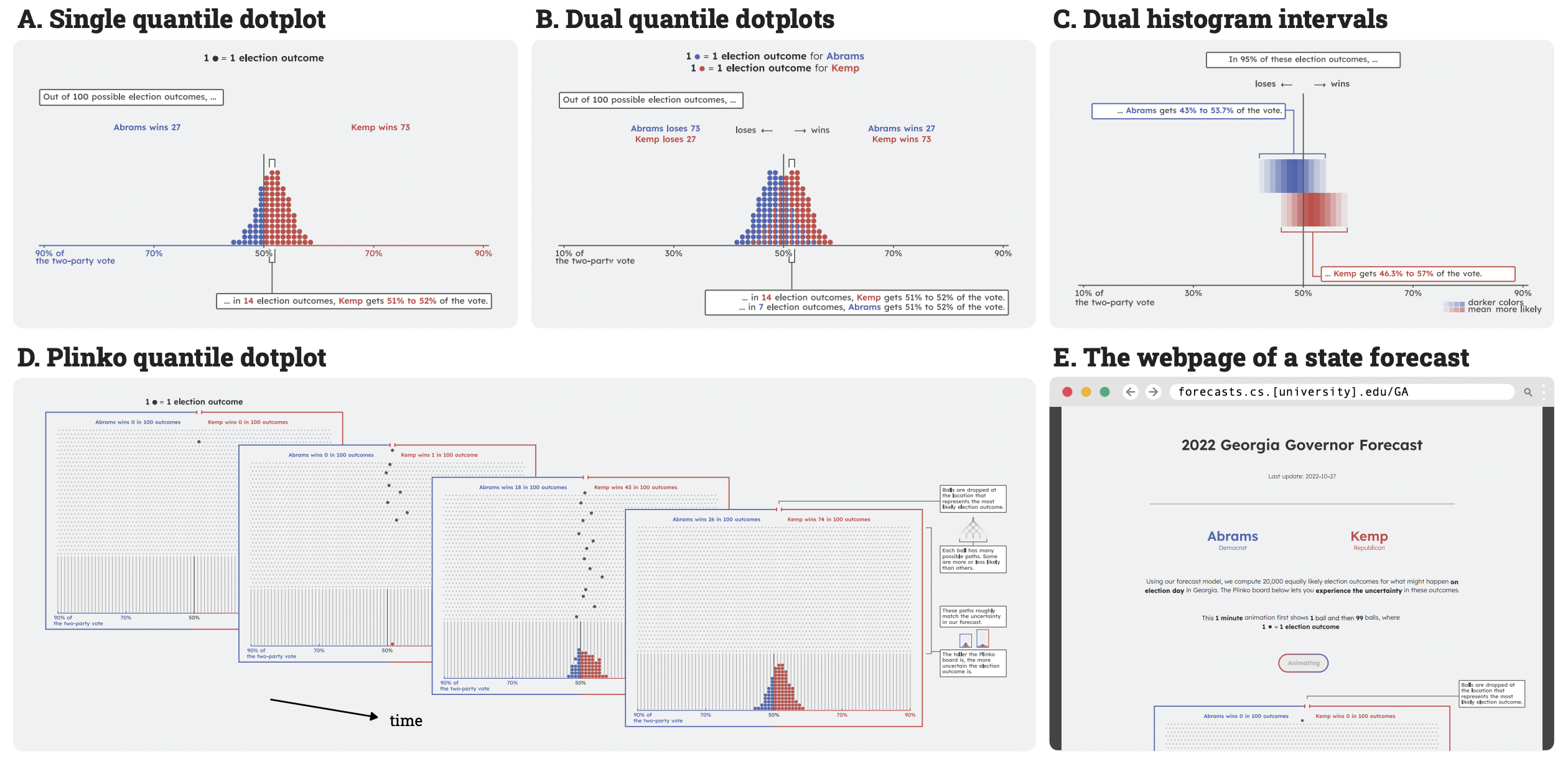
The four election forecast visualizations in our longitudinal study: A. Single quantile dotplot (1-Dotplot), B. Dual quantile dotplots (2-Dotplot), C. Dual histogram intervals (2-Interval), and D. Plinko quantile dotplot (Plinko). In the 2022 U.S. midterm elections, we frequently updated this website to include the newest forecasts. Here all four visualizations show the forecast for Georgia on Oct. 27, 2022, which predicted a 73% probability of the Republican candidate Brian P. Kemp winning the governorship.
Abstract
We conducted a longitudinal study during the 2022 U.S. midterm elections, investigating the real-world impacts of uncertainty visualizations. Using our forecast model of the governor elections in 33 states, we created a website and deployed four uncertainty visualizations for the election forecasts: single quantile dotplot (1-Dotplot), dual quantile dotplots (2-Dotplot), dual histogram intervals (2-Interval), and Plinko quantile dotplot (Plinko), an animated design with a physical and probabilistic analogy. Our online experiment ran from Oct. 18, 2022, to Nov. 23, 2022, involving 1,327 participants from 15 states. We use Bayesian multilevel modeling and post-stratification to produce demographically-representative estimates of people’s emotions, trust in forecasts, and political participation intention. We find that election forecast visualizations can heighten emotions, increase trust, and slightly affect people’s intentions to participate in elections. 2-Interval shows the strongest effects across all measures; 1-Dotplot increases trust the most after elections. Both visualizations create emotional and trust gaps between different partisan identities, especially when a Republican candidate is predicted to win. Our qualitative analysis uncovers the complex political and social contexts of election forecast visualizations, showcasing that visualizations may provoke polarization. This intriguing interplay between visualization types, partisanship, and trust exemplifies the fundamental challenge of disentangling visualization from its context, underscoring a need for deeper investigation into the real-world impacts of visualizations. Our preprint and supplements are available at https://doi.org/osf.io/ajq8f.