
Watching the Election Sausage Get Made: How Data Journalists Visualize the Vote Counting Process in U.S. Elections
Mandi Cai and Matthew Kay
ACM Human Factors in Computing Systems (CHI) 2024 | ![]() BEST PAPER HONORABLE MENTION
BEST PAPER HONORABLE MENTION
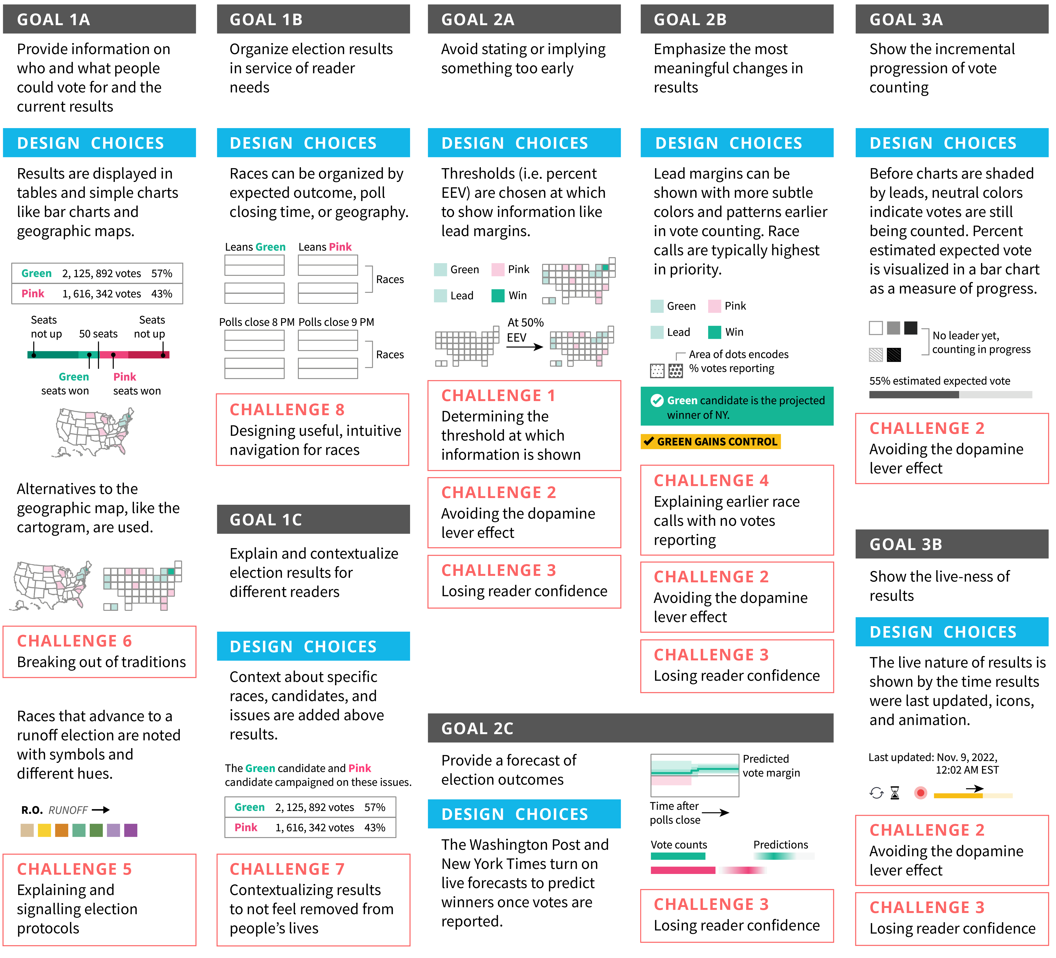
Mapping of participants’ design goals to design choices that incorporate components of our visual vocabulary. Challenges faced during the design process are listed under the corresponding design and goal.
Abstract
Election results in the United States are visualized online in real time by news outlets as vote counting persists over days or weeks. They are a massive public-facing exercise in managing audience understanding of uncertainty in partial data, breaking news web traffic records as the public seeks information about winners. We categorize designs of real-time election results from 19 U.S. news outlets and election results providers for the 2020 and 2022 general elections to create a visual vocabulary of live results. We then use this vocabulary to guide interviews with data journalists who worked on these designs to understand their design goals and challenges. Tying these conversations back to our visual vocabulary, we map out how communication goals like balancing certainty and uncertainty in the journey towards finding out winners, alongside challenges like determining thresholds at which information is shown, manifest in the designs displayed.